
DIGI:CHECK

Education Platform of the Chamber Of Labor Carinthia

Online education is very important. To compete nowadays, no matter what you do, you have to have a digital knowledge. The Chamber of Labor Carinthia reached out with a concept for a platform with different classes and programs in multiple types such as online, blended and on-site which will be offered to members of the chamber. For free.

FACTBOX

  • Teamsize:

    core team: 4
    15 people involved

  • Duration:

    8 months

  • My Role:

    UI/UX Engineer/Designer, Frontend Developer (static)

  • Main Technologies:

    PHP, Laravel, October CMS, UIKIT

  • Design Tools:

    Adobe CC (mainly XD)

Starting from scratch

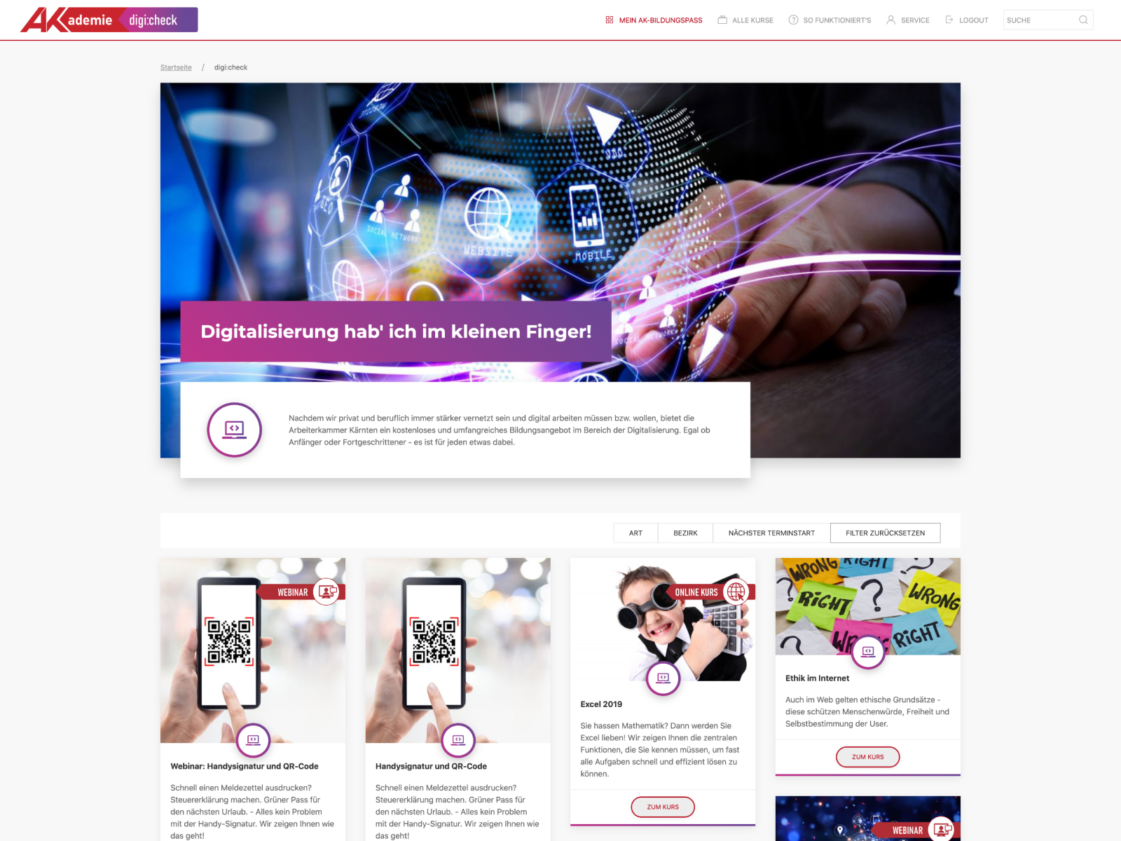
Let us narrow it down to its core-functionality. Again, content is king. The reason why a user is visiting this platform are the classes and courses they can attend.

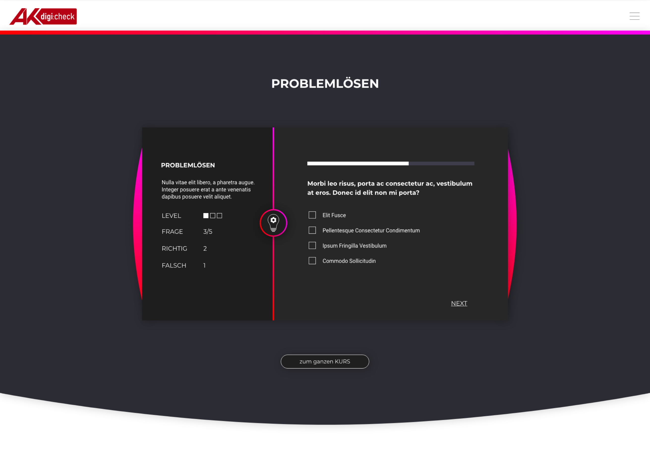
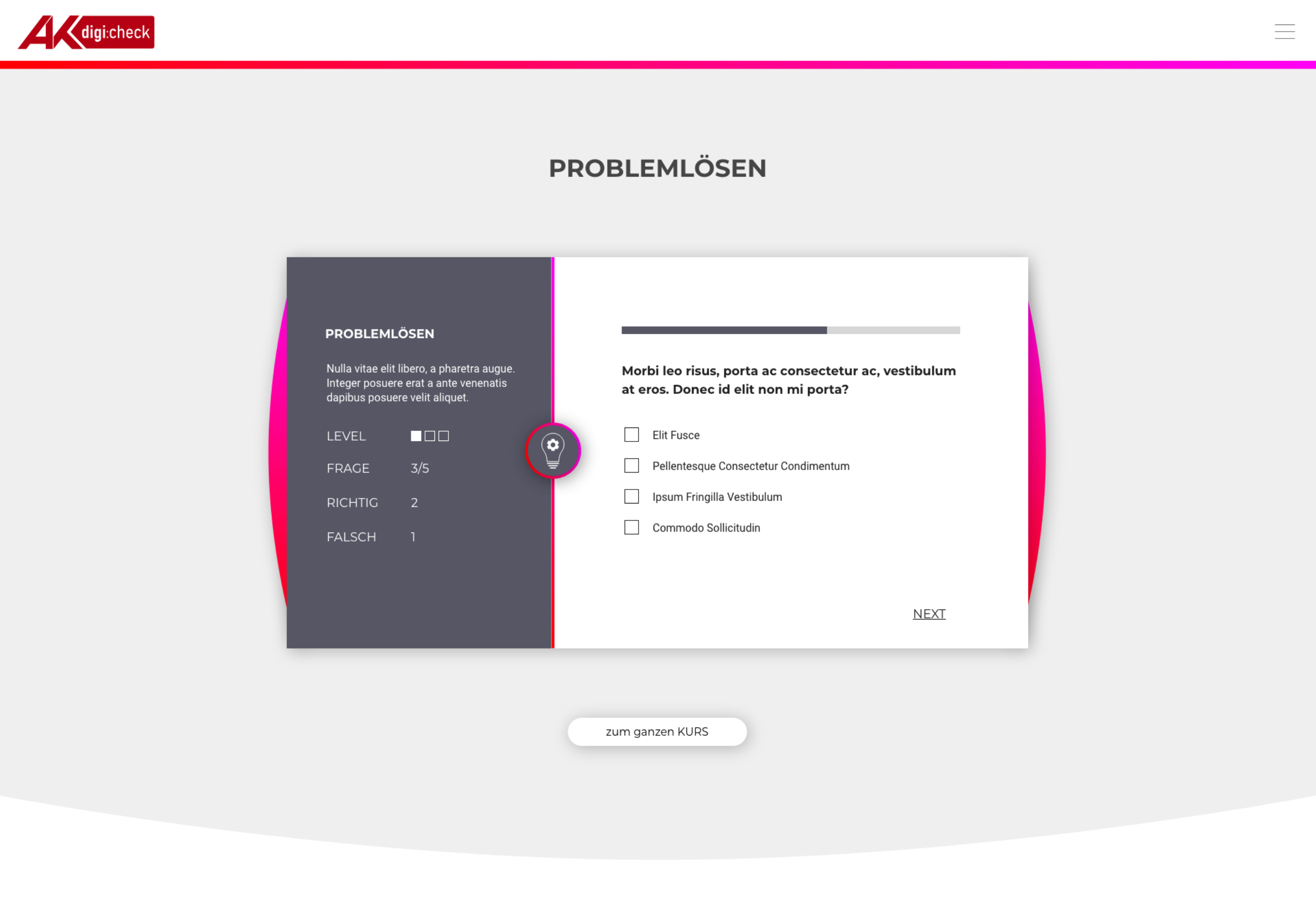
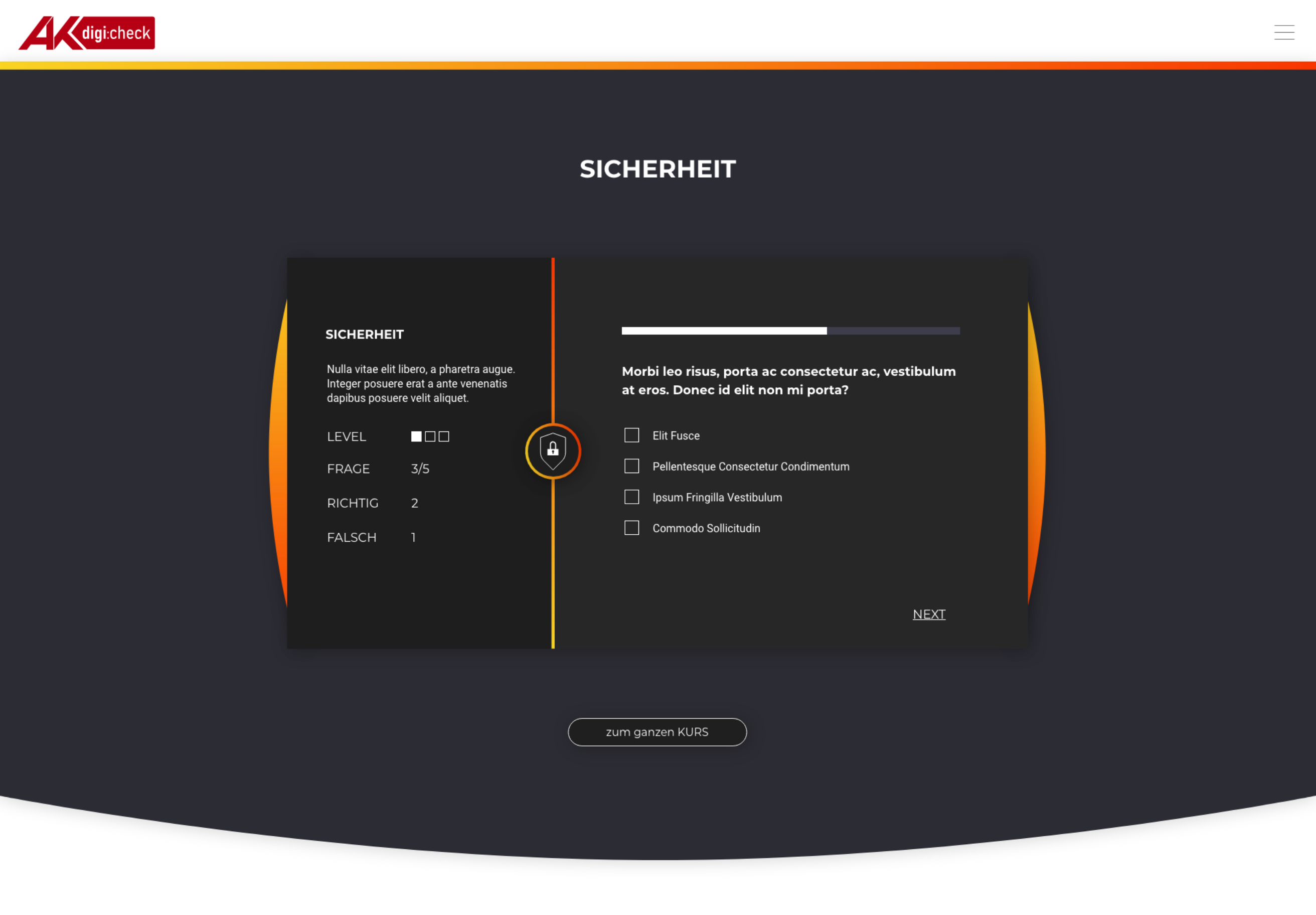
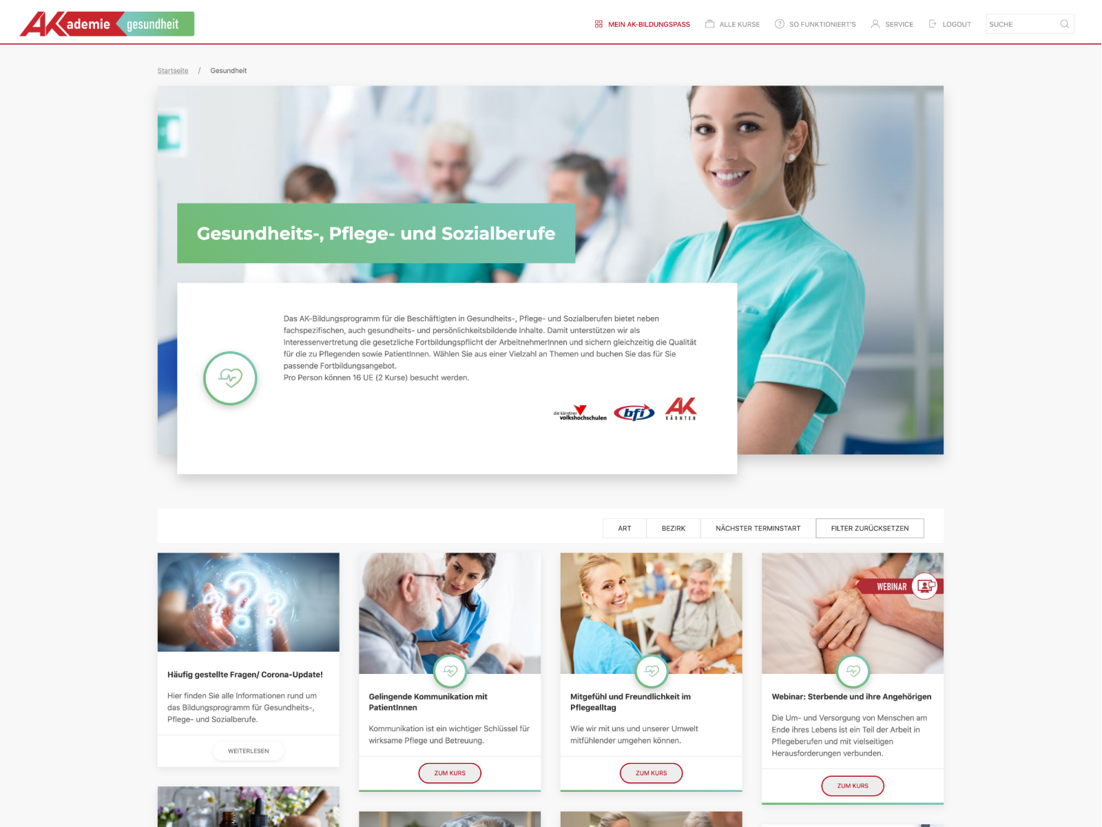
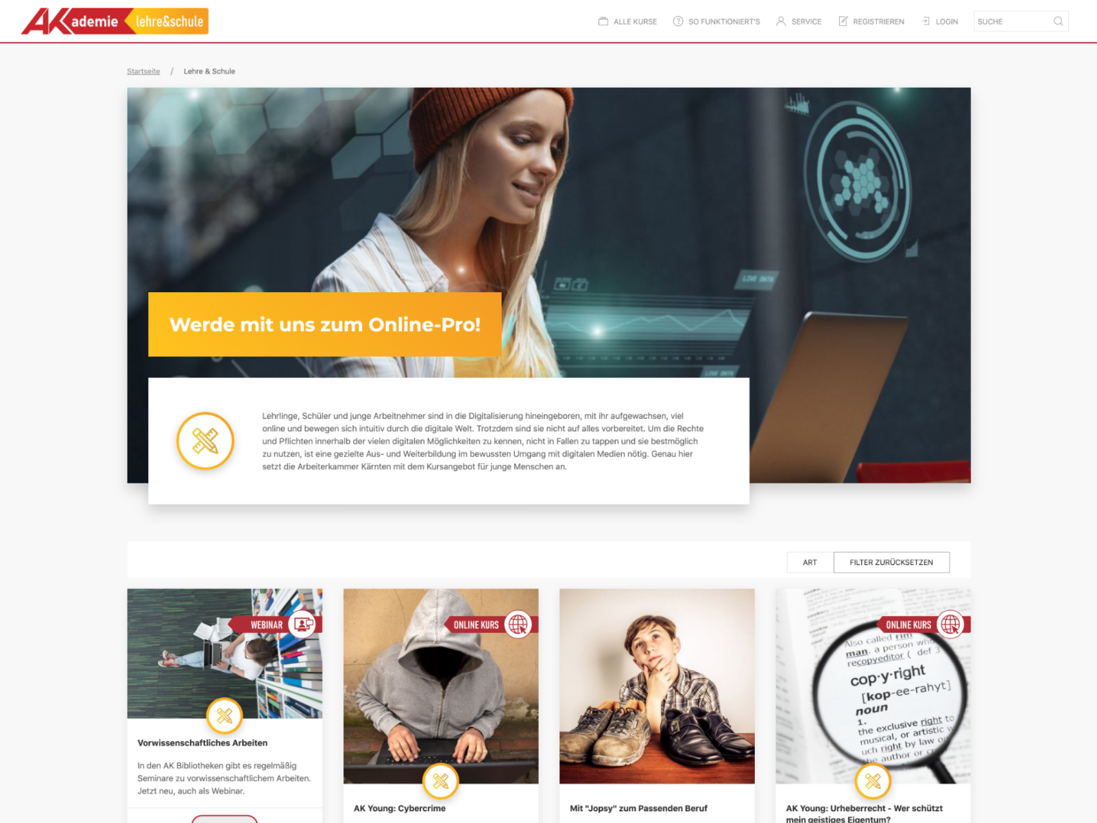
This project evolved over time with its content but when it started it had 5 digital categories for different fields of education. Each category should be recognizable with its unique icon and color scheme.

Those screens, elements are more for visualisation in a futuristic style. It was not meant to stay like that but to open the discussions its always a good approach to already have some high end visuals.

I also knew that those designs are really hard to code with all this round circle elements and shapes with gradients and shadows. But since I knew that I will do the frontend development I also knew that I only make my life harder than from another developer. And the chances were also high that they will not go for this complicated fancy designs. I was right about that. But again, they helped a lot to start the dialogue.

The Userjourney

This topic is huge and too many questions have to be answered. I don’t wanna go into depth or in too many details from where the users are coming from and on which page the will land. If its over an AD or via the a link which will be send out to the members.

I wanna break it again down into a “normal” user approach beginning from the home page:

  • An overview of courses and a possibility to filter it regarding to categories, location, type and so on.

  • Details about a single category with corresponding classes/programs/courses.

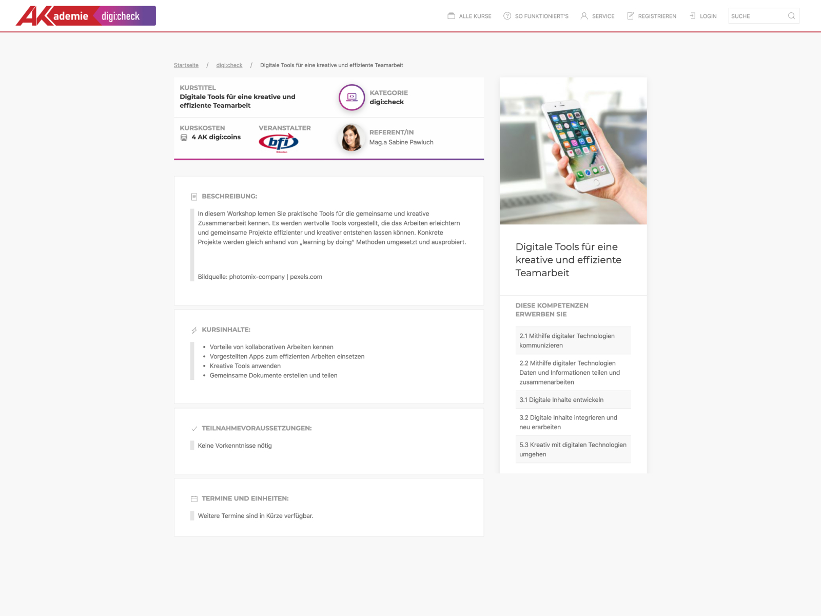
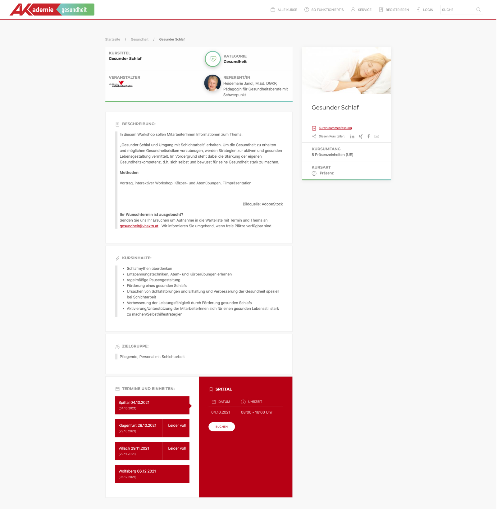
  • Curriculum of a single class/course/program with all the details they need to know.

  • Registration/login possibility

  • A user backend with their classes they are attending after booking it.

  • Feature: a quiz to let the users know how much they already know and to give them recommendations.

Organizing details

Since every course differs to another with different types such as on-site, online or blended the layout has to be modular and adjustable to the unique needs.

Designing screens and elements is always hard when the content can be different in terms of text length, headlines, amount of images and so on. The first step is to gather as much information as possible to see as many options as possible.

With this information you can start to see if something will always be the same or determine which areas are always visible.

Make it personal

The difference of a visitor and a user is quite obvious to me:

A visitor only visits the website and reads the content and maybe navigating to different sections or parts.

A user uses the services the website/platform/application provides. Not only consuming the content, also register to get other services offered like in this case a user dashboard where the user is able to make a quiz to see how much knowledge he or she already has and to give the user some recommendations of different courses.

You can also see in this login-example how the first high fidelity draft transformed into the final result.

Something special

To recommend courses/classes/programs to the users based on their knowledge there was a quiz-feature where  the users had the chance to test themselves. So they know how much knowledge they already have and the backend knew what kind of classes could be of interest for them.

It comes together

A user backend always provides possibilities concerning the personal profile. In this case the focus was clearly on the classes/courses/programs divided into following categories:

  • recommended
  • current
  • completed

The user also has within the course-information-card all  the necessary information and call to actions at one glance.